Graph - Redesigns
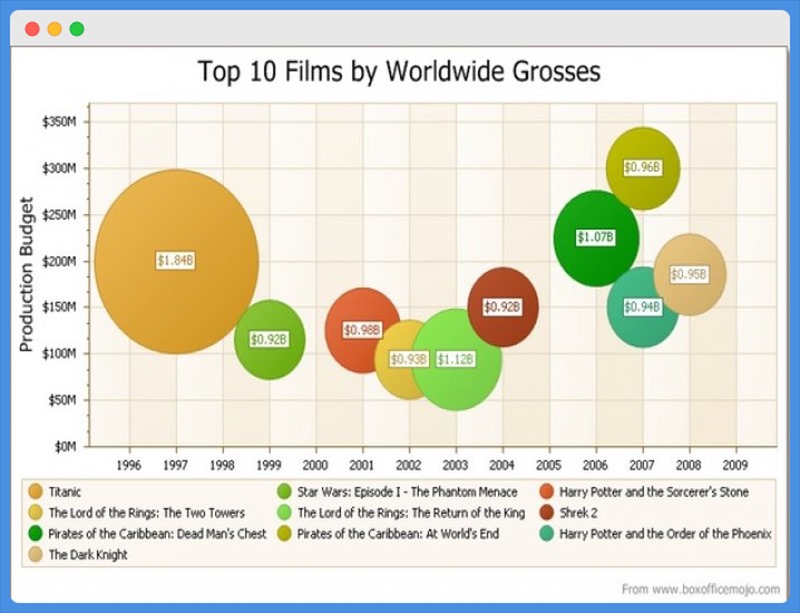
Let us proceed with the second graph. The above bubble chart is trying to give us information regarding the Top 10 Films by Worldwide Grosses. It shows the names of the Films, Year - the film has released and its Production Budget. But there are a few issues with the above chart.
Usually bubble charts are a way of evaluating the relationship between data points visually. In the above chart, there is no relationship found between the bubbles. If the bubbles were not labelled, drawing conclusions by the size of the bubbles might be difficult.
Even though the Star Wars: Episode I-The Phantom Menace film’s production budget is equal to the production budget of the film Shrek 2, the placement of the bubbles in the above chart is uneven.
But the graph can be redesigned in a proper way for a better understanding and the best way of visual representation is a bar plot.
Redesign 1
In the first redesign, we are plotting a bar graph using ggplotly to perform interactive data visualization.
Redesign 2
The below graph is the second redesign for the above bubble chart. We are plotting an interactive scatter plot using ggplotly where each point in the graph represents a Film.