Graph - Redesigns
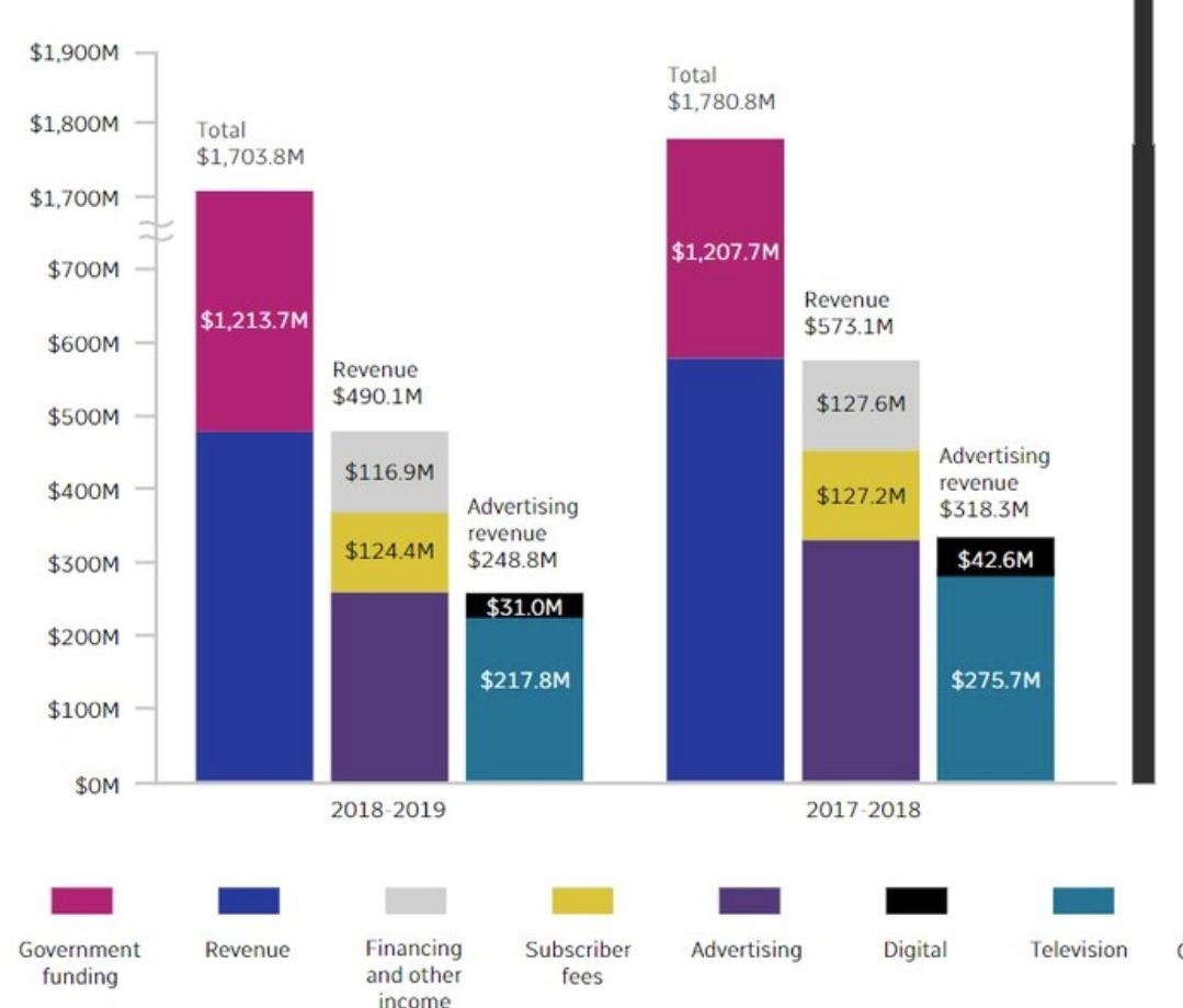
Let us observe into the above chart from the Canadian National Broadcast Company showing their sources of funding in two financial years. It looks simple and easy to understand, but there are few flaws in it. Let’s have a look into it.
We can see that the Y-axis scale is not properly arranged. It has a break in it. The lower ticks on the Y-axis scale are separated at $100M. But there is a sudden increase on the scale from $700M to $1700M. Due to this, we can see that the bar of the Revenue in both the years (2017-2018 and 2018-2019) is greater than the Government Funding which is not true.
The labels for the Revenue and Advertising Revenue are placed on the wrong bars, which is leading to the misinterpretation of the graph.
Another issue we found is that the Television is shown equal to that of the Government Funding because of the break on the Y-axis scale. We can say that the above graph is a misleading graph which is not providing us with the proper data visualization.
Below are the two redesigns which will help us to understand the given data in a better way.
Redesign 1
The first redesign is a bar plot plotted between the Funds (in Millions) and the Source of Funding for both the given years.
Redesign 2
The second redesign is a Juxtaposed graph. In this graph we can see the seven Sources of Funding shown for the given two years.